Bath & Body Works Dimensional Typography
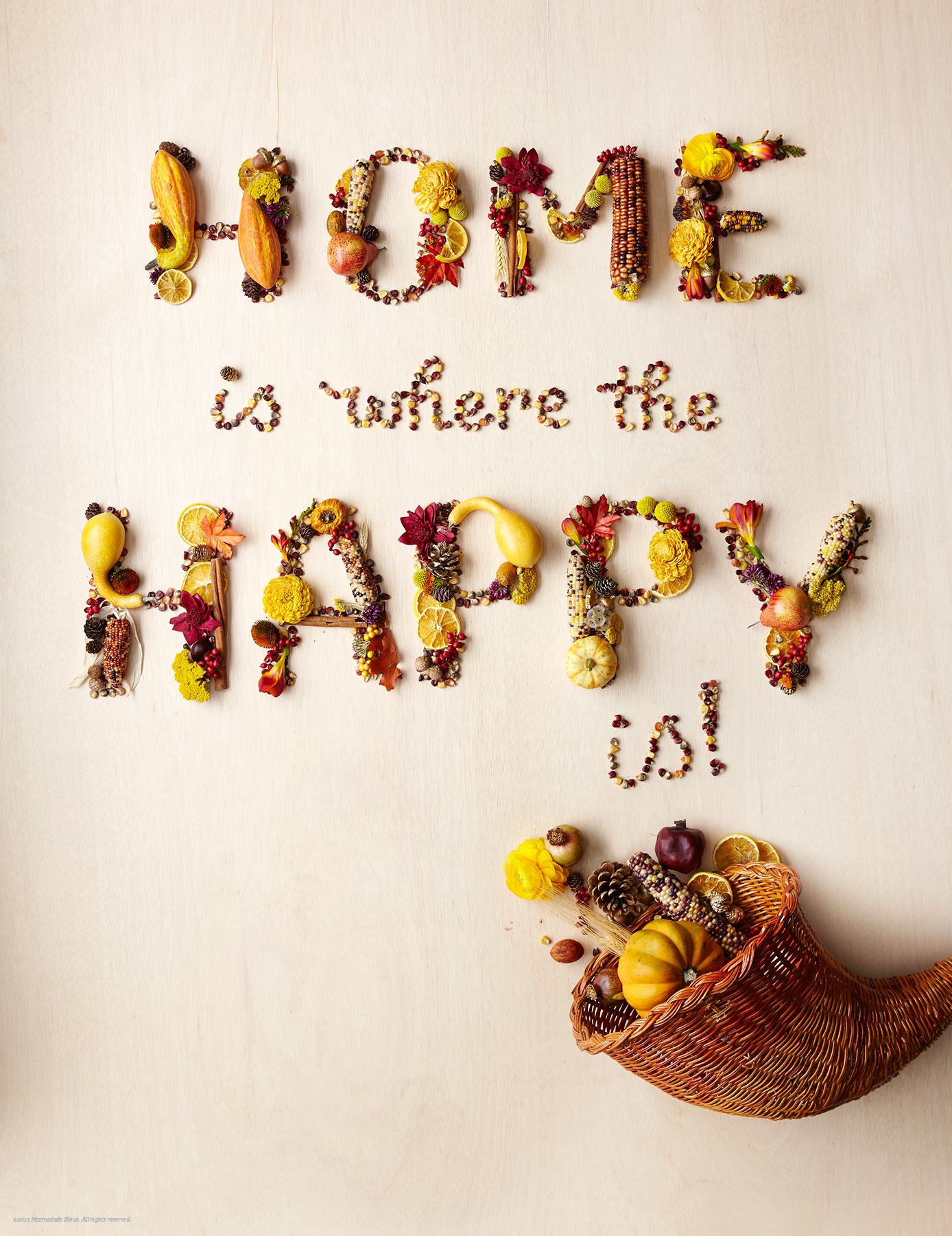
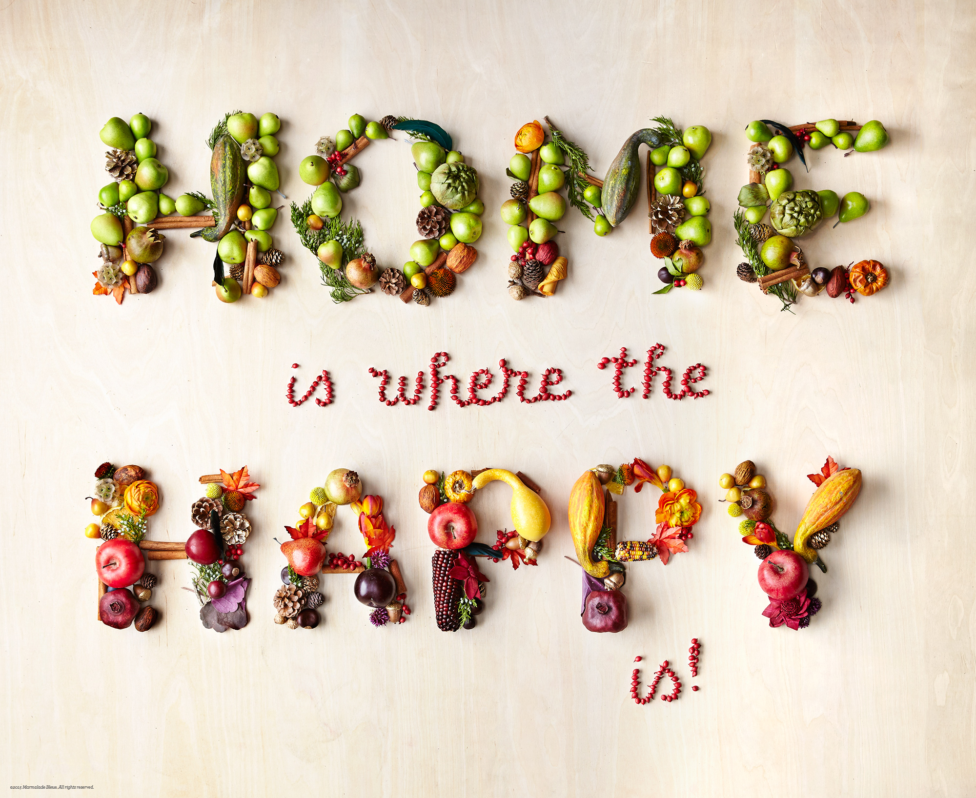
When B&BW called looking for in-store signage, I was excited to bring the local retailer to life for the Thanksgiving season. After a few rounds of revision and testing, we determined a cornucopic effect of fruits, flowers, gourds, and spices would best convey the bounty of family dinner.
The first image was built in a tighter color palette inspired by the warmth of fall, the second with an ombré effect, shifting from crisp greens to rich purples. After two building two versions, the first was chosen to grace B&BW's social media channels.
Photography // Sang An
Photographic Direction // Ken Baldwin
Design Direction // Frank Noca
Styling & Sourcing // Lisa Lee
Styling & Assistance // Erin Robey
Production // Kathy Eng