Cadillac Magazine’s Dimensional Typography
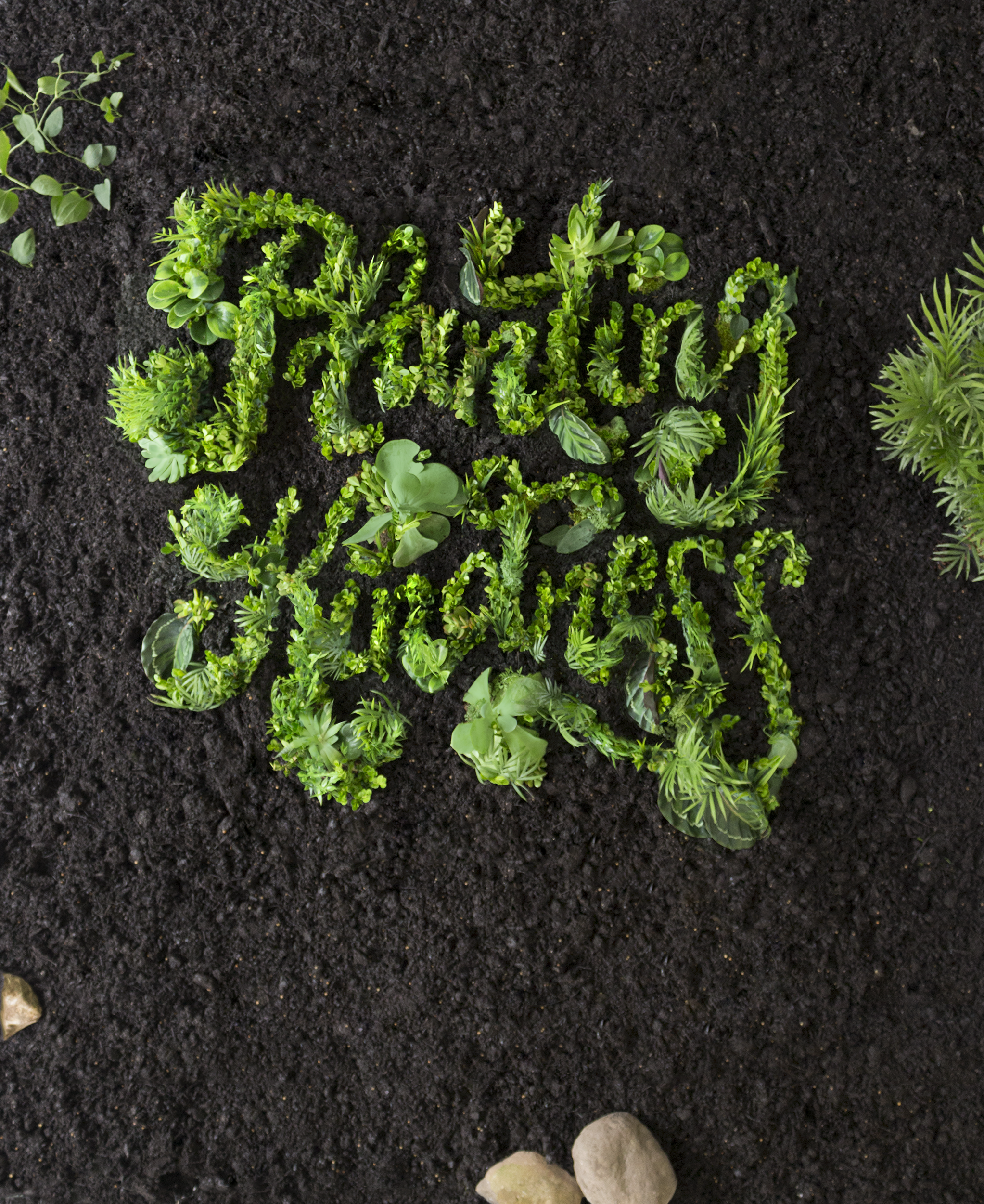
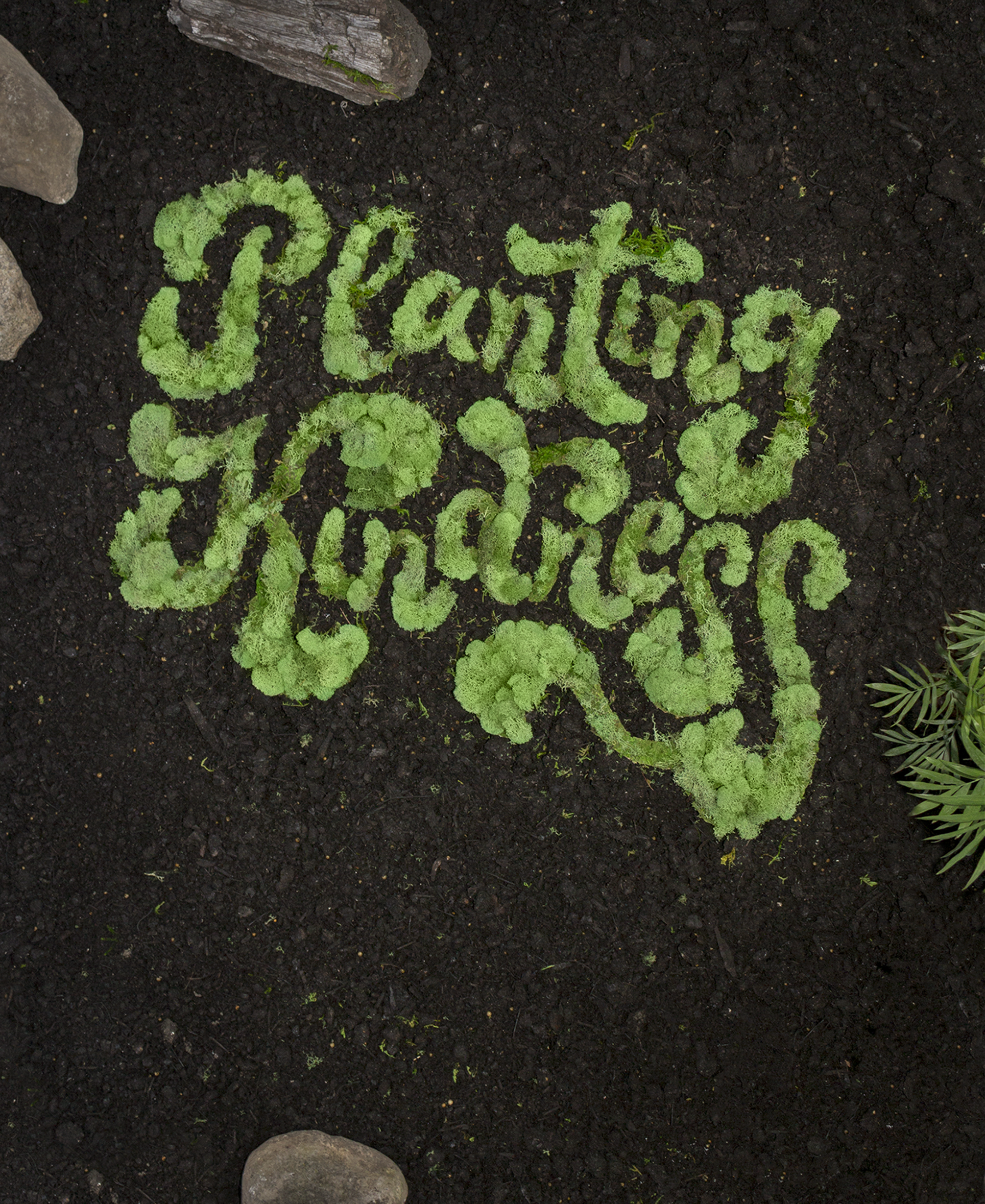
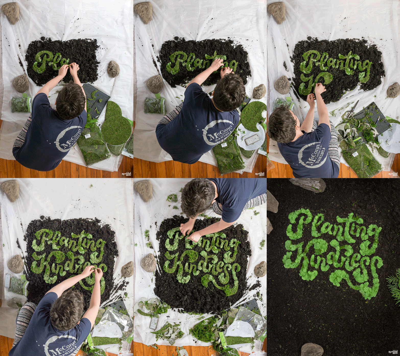
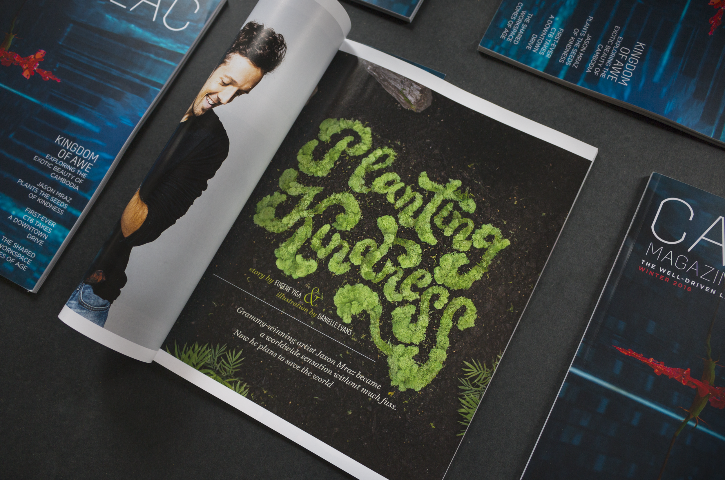
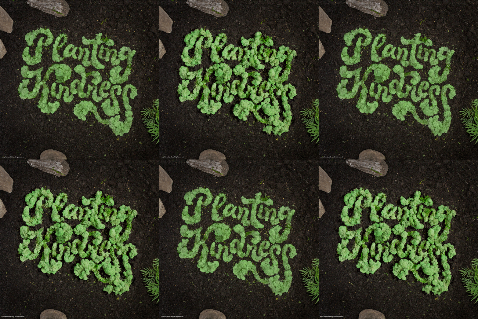
Cadillac's publication for the well-driven was looking for a lush, garden inspired headline to compliment an article on Jason Mraz's manifesto. I chose a lettering treatment befitting of the groovy singer and philanthropist, creating two versions: one tropical and lush, the other mossy and creeping. Each was shot in natural light, then compiled into a making-of cover for the app.
For the first, I created oversized lettering on a grid of foam bricks, then literally planted hundreds of shrubs, succulents, and IKEA plants into warm earth.
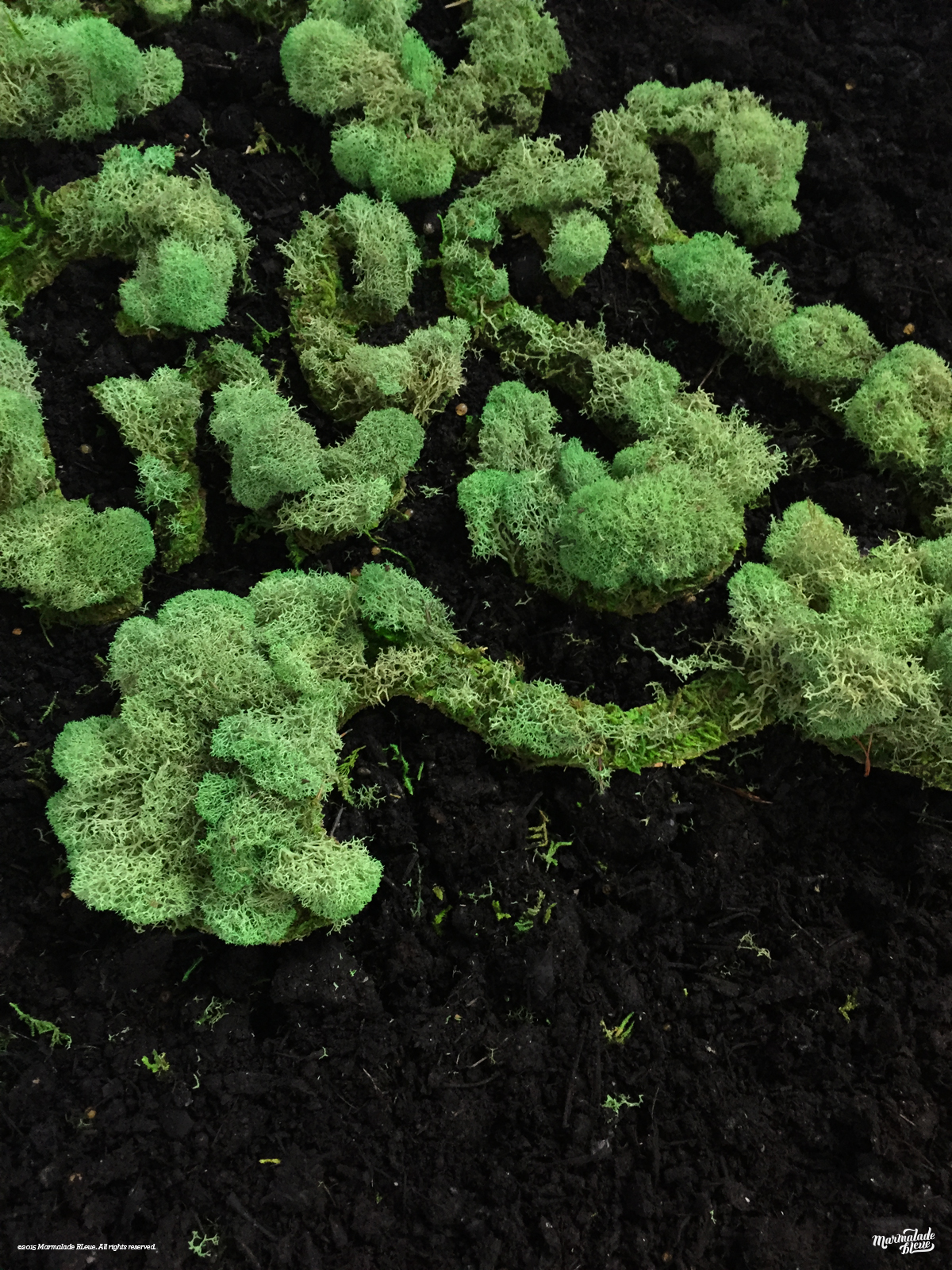
The second image opted for a lower, more uniform look by cutting rough shapes from sheet lichen, then affixing live moss. The 42" wide image continued to spread happily after three days, destroying legibility.
Art Direction // Cassidy Zobl
Prop Styling & Assistance // Erin Robey
Special Thanks // The Wonder Jam
