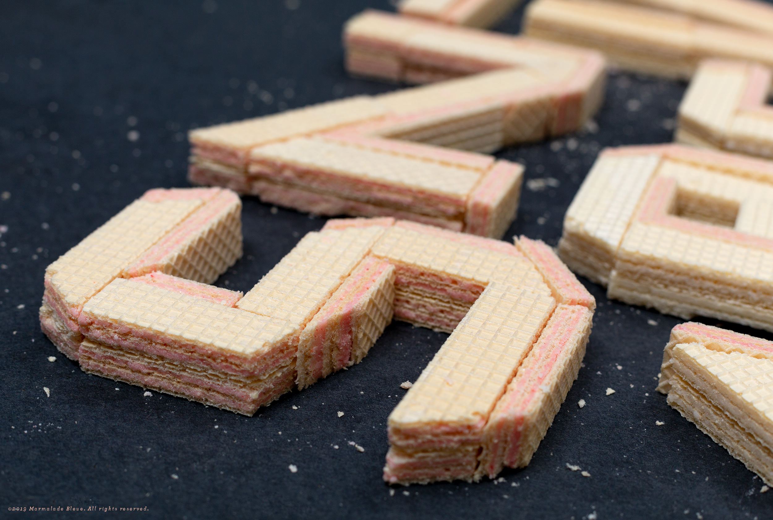
Snack Attack Food Typography
Wafer for it, post-lunch munchies are coming for you. When the much beloved Voortman cookies changed their recipe (fair enough, it’s been twenty-five years), the original plan for this slab lettering had to change. Layered wafers with their built-in grids allowed for a 2:1 stacking and created a natural shading in the letterforms. Because the width was fixed, the letters allowed play in the baselines with a shared last couple letters that still manages to read.
Additional Photography // Jack Juris


