Typographers with Dimension: Enon Avital
NYC based designer Enon Avital meditates with dimensional type after hours, impressively and exclusively in Hebrew. His work is complex but lighthearted and extremely resourceful, which matches his irl persona, making him the perfect addition to my dimensional typographer series.
Name
Enon Avital
Website
Background
I started with a major in fine arts/painting, then went on to have a full-time career as a UX designer where I write html and css all day. It’s another way to draw things, but it’s work I’m doing for someone else. Around February 2015 I decided to start creating for me and got in the habit of losing myself to meditations of doodles and lettering.
In execution, these two lines of work couldn’t be any more different. My UX job is all systems, grids, and strict libraries of code, while the lettering is pretty much a free-for-all and for the most part created by hand. But the more I sculpt, the better my analytical code-based thinking gets, and vice versa: after a long day of coding I find myself creating my best typography work. This is the number one reason why I keep on going, and don’t intend to ever stop the after-hours lettering. Switching off and doing something completely different is the absolute best way to come back refreshed.
When I picked up my pencils again, I had two considerations in mind: I knew that I wanted to do something that’s different than lettering I was seeing on Instagram, and I had to do something that was uniquely my own. My own in that I’d rely less on looking at what other people were doing, and instead force myself to be more creative, to think harder about solving lettering problems, to be as innovative as I possibly could be. Hebrew, then, was a natural choice. I hadn’t known about any other Hebrew letterers, so there’d be nothing for me to refer to, and the work would be uniquely mine. Eventually I found a massive community of Hebrew lettering artists, so to celebrate their work and aid discovery, I now curate @hebrewtype on Instagram, featuring Hebrew lettering from around the world.
Experience in the Field
Since 2015
Describe your designated workspace, if one exists.
I have a 2’x2’ piece of wood that I painted white, and almost everything I make is arranged and photographed on that small slab. Working out of a very cozy home office, I use a lot of creative storage solutions to keep my tools and materials (including some lighting equipment, my desk, my computer, several printers, and bookbinding machinery) in my tiny space. There is a narrow closet fitted with as many shelves as possible, and space under a guest bed, for hoarding all of my worldly treasures.
Medium(s) used?
Original/Final Fine Art Pieces
Preferred Materials and why? Does the message dictate the materials, or vice versa?
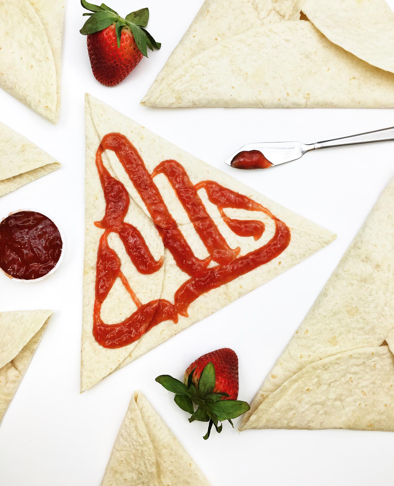
A lot of my material choices are defined by how they fit in my confined workspace (more on that later). I typically use things I already have in my house, mainly food and other items borrowed from the kitchen or my kids' craft table. So when an idea strikes, I do a quick comb-through to find something on hand that’ll compliment the piece nicely.
There were a few instances where the work was built around the material I chose, for example: deciding to use a watermelon slice to sculpt some letters, before knowing what I’d be writing, or when I used swag from Creative South to write the word “inspiration.” Though for the most part I do it the other way around: letters first, materials second.
Do you use special tools to build letterforms? Do these vary and why?
It was during my sophomore year in college when I started using both digital and analog tools to paint. The process of sketching with a pencil, then taking a ride through the vector machine to create the final piece out of raw materials is where I find myself most comfortable. There’s something about making use of every tool possible that feels just right.
I’ve been asked by peers and teachers if my process is a commentary on twenty-first century tools, being nostalgic with materials, and finding ways to marry the two. The truth of the matter is: I found a method that lets me get things done faster, and it just so happens to be an analog/digital combo. Does that make me lazy? Maybe. I like to think of it as efficient, and it’s definitely not an intentional commentary on anything other than improving my efficiency.
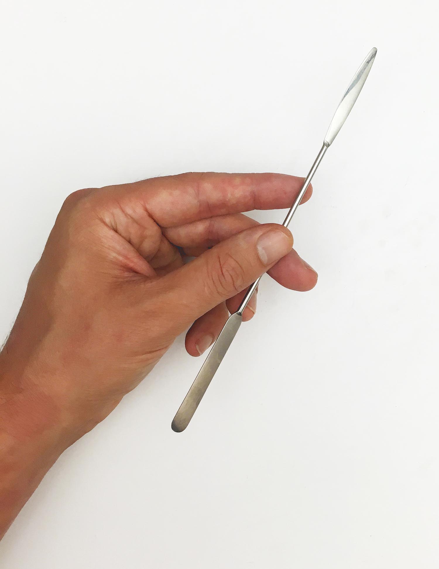
As for arranging smaller objects, I have a teeny-weeny micro spatula for lining up materials into super-neat edges. My fingers are a little shaky for using on their own, so spatula (and a handful of other tools, pictured) ftw, every time!
List 3 Adjectives Describing your work.
Surprising
Whimsical
Fun
Concept vs. Execution
What challenges do you combat during the ideation/building process? How do you overcome these obstacles?
Most of the lettering I do is for my own enjoyment. I usually have something in mind, plus I have a long backlog of ideas, so coming up with something to do isn’t a big area of struggle. Occasionally, execution presents some challenges if I have an idea that doesn’t work in real life. I once wanted to make some lettering out of water without entirely understanding how hydrophobic coatings work, so I made a sloshy mess and eventually moved on to another idea.
When it comes to client work, on the other hand, time can become pretty problematic. Being able to work together with my client in a way that feels like they’re part of the process can be pretty darn difficult, especially since I only have late nights to actually do the work. But in general I have the luxury of lettering being a hobby, not my main source of income, and having less pressure does wonders to executing ideas on a regular basis.
Solo vs. Social? How do you operate now and do you plan to change direction in the future?
The nature of how I work means it’s a solo pursuit. I snack on sketches during my commute, or while waiting in line, then create the final work during the wee hours of the night.


