Condé Nast Food Lettering Heritage Brand
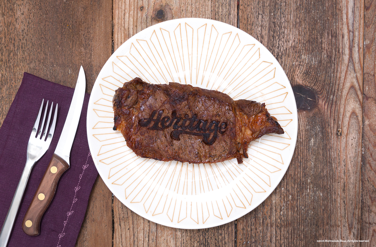
Rarely does the iron literally strike while hot in my line of work, so when Condé Nast imagined a branded steak, I couldn't refuse. They envisioned a rustic sirloin, seared with Heritage to cap their Foodie Glossary digital campaign.
I worked with BrandNew, a custom iron caster in Santa Barbara, to design a 4" kitchen grade, stainless steel brand. The turnaround from concept to table was four days, but the process was incredibly smooth and the results were incredible.
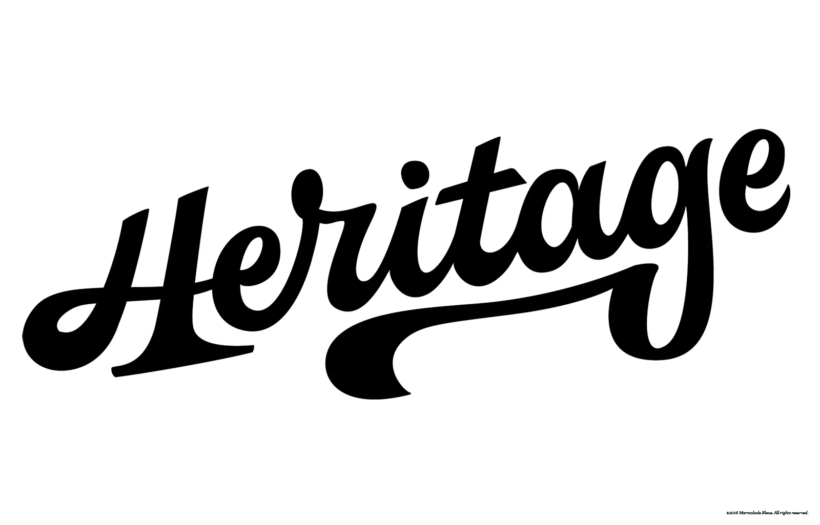
Condé Nast required a slightly masculine, Midwestern agricultural vibe to sell the headline. Crafting a usable brand required low contrast, chunky forms, ideally connected forms. After a couple sketches and countless tweaks, I produced the above and physically held the iron in an impressive three day build and delivery. Designing to such a small scale is rare, but BrandNew blew all expectations away. The craftsmanship was meticulous, precise to my vector file and came with easy-to-follow instructions.
Two steaks and a blow torch run later, the sirloins were tested and retested by applying consistent heat until red, then pressed for a minute. Pro tip: remove any batteries from smoke detectors or head outside to sear.
The brand transfer was remarkably accurate, though I hadn't accounted for the uneven surface area of the sirloin. With some darkening in post, the searing epiphany comes to life, at least it's still mooing.
Special Thanks // Erik Attkisson
Brand construction // BrandNew
Visit the Condé Nast campaign to view other delicious imagery.


