The Beautiful Game: Joga Bonito in the Lettering World

It's no secret that much of the creative community is buzzing with residual World Cup excitement. Before our days as sedentary lumps, many of us donned a kit and cleats, charging after the ever-elusive ball as part of the traditional eight-year-old swarm. The nostalgic feel-goods are in full swing, now complete with sweaty bottled beers.
I was inspired in part from my lifelong experience with the game, but also from the chosen phrase, Joga Bonito. Soccer god Pele popularized this fascinating entendre, which means colloquially The Beautiful Game and literally play beautifully. While twisting the yellow nylon laces (I had three days to wax philosophical), I began chewing on the similarities between lettering and soccer, and I came to a few conclusions:
Layers of meaning.
Good games communicate at various levels, allowing the viewer to involve themselves casually, intently, or obsessively. Lettering is such a dimensional way to communicate, as the viewer can scan, skim, and chew on layers of meaning. When letterforms are rendered instead of typed, serifs and flourishes can speak articulately to an historical setting, an idea. Similarly, soccer is more than 22 players huffing up and down a field, but a demonstration of cultural and political strategy. By illustrating type, the maker creates context within and around a single word, giving the viewer direction where simple pictures cannot. Athletic prowess and elegant runs certainly contributes to an interesting match, but it merely scratches the surface.
Confidence and agility.
Working with one's hands gives character to drawn type, allowing the creator to inject personality into each loving stroke. In the same way soccer is a sport of agility, creating letterforms by hand allows the maker to utilize their entire arm, or in my case their entire upper body, to capture energy. Leveraging fulcrums at the elbow, shoulder and waist give strokes straighter, bolder lines and push a piece further, much like a well executed cross field pass.
Acessibility.
The Beautiful Game speaks to an international audience across gender, social status, age, etc, and good lettering should do the same. While garnering style points, a good type specimen should be somewhat legible and admirable from a technical and conceptual standpoint. The delicate balance between consistency and spontaneity gives handlettering its cohesion and character. Whether bending balls or beziers, playing beautifully ensures that our game captures deliberate energy and continues to flourish.
If I've learned anything from the Germany's erratic climb to glory, it's this: practicing joga bonito is a constant exercise. A perfect match does not make a perfect run, and for lettering to remain a concentration in the creative community, we must continue to produce excellent letterforms. Playing beautifully in our field of choice, whether paper or pitch, will ensure the achievement of an elegant goal.
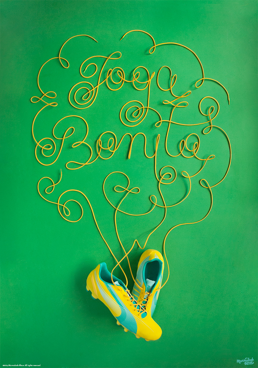
Click here for more process shots and technical notes on creating this piece.