(RED) Food Typography Fighting AIDS
I’ve been observing (RED) campaigns since middle school, wandering up and down the mall looking at GAP shirts and iPods with the trademark brick colored swatch and wondering how coercing my mom into buying me a tee shirt would benefit the world. Donation through purchase persisted as an effective way to turn consumers into activists, perpetuated largely by the good people at (RED). Needless to say, I blushed when they asked me to participate in this years quest to #86AIDS.
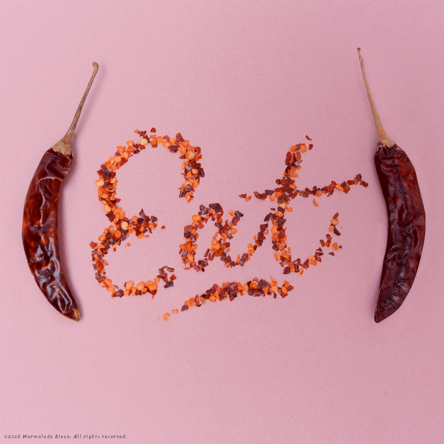
#86 is food industry slang for running out of an item, which is why my work made sense as a vehicle for such a powerful message. I opted for red based foods nested in parenthetical marks to mirror the brands; the lettering style reflected a diner while the background would flash light pink to red, resembling neon signage.
For #86AIDS, I opted to created a stop motion food lettering surrounding their collection with Jeni’s Ice Cream, another well known Columbus brand. The video opens with a cherry octothorpe that splits into their signature parentheses. Ice cream numerals were frozen and refrozen into the shape of numbers until the consistency was solid. The ice cream typography began melting immediately, but lasted long enough to make a cool punctuating video for the campaign.
Visit the (RED) blog where I’m interviewed about the uniting and polarizing nature of food and the effects of cause on consumerism.
Production Assistance // Frances Ora-Kelly