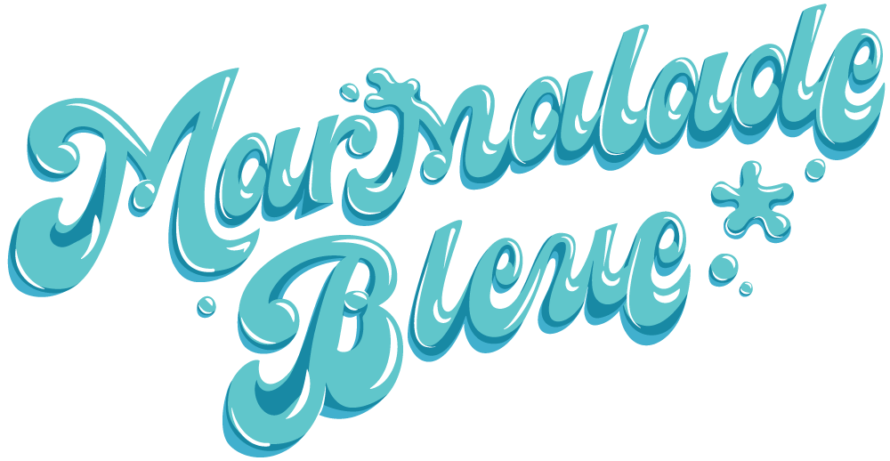
Typographers with Dimension: Elsa Martins
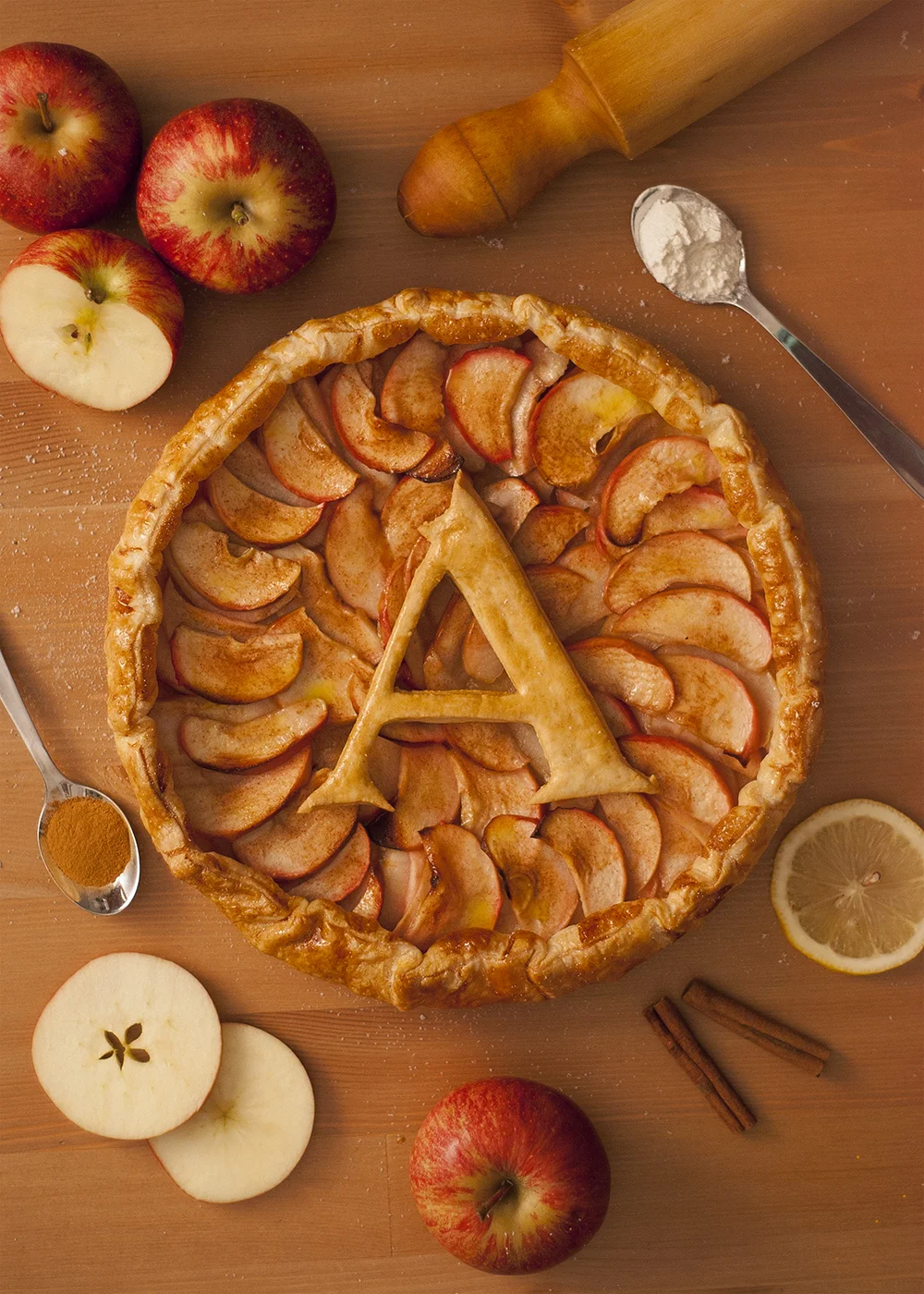
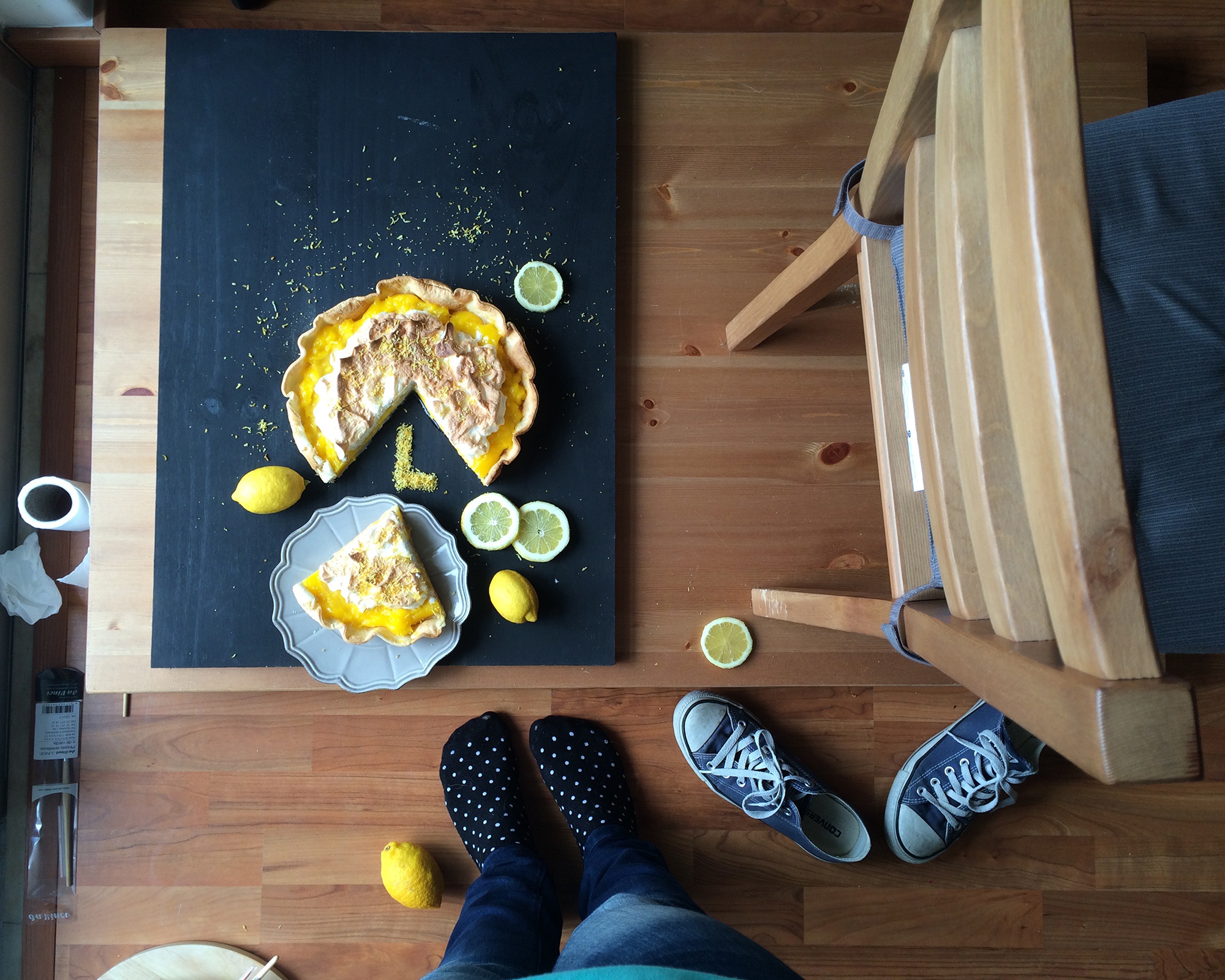
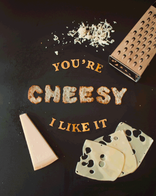
Elsa Martins is a Portuguese based illustrator with an adorable and warm aesthetic. As part of the #36daysoftype Instagram challenge, she baked, fried, and twisted a charming food type drop cap alphabet reminiscent of the early days of foodtypography.com. Elsa's work is enchanting, imperfect, and delightful, winning her the final spot in the Typographers with Dimension feature.
NAME
Elsa Martins
WEBSITE
BACKGROUND
I've always had different interests inside the creative field. I started my career in a photography studio as I wanted to work as a photographer. Then I got interest in design and gone back to school to study it. I have since worked as a graphic designer and illustrator.
This background I believe, made it easier, natural even, to start experimenting with food lettering as I already had a good experience with photography, lighting, composition and even lettering. And also, I love food. So basically this kind of work is a perfect balance between different things I love doing.
EXPERIENCE IN THE FIELD
Since 2016
DESCRIBE YOUR DESIGNATED WORKSPACE, IF ONE EXISTS.
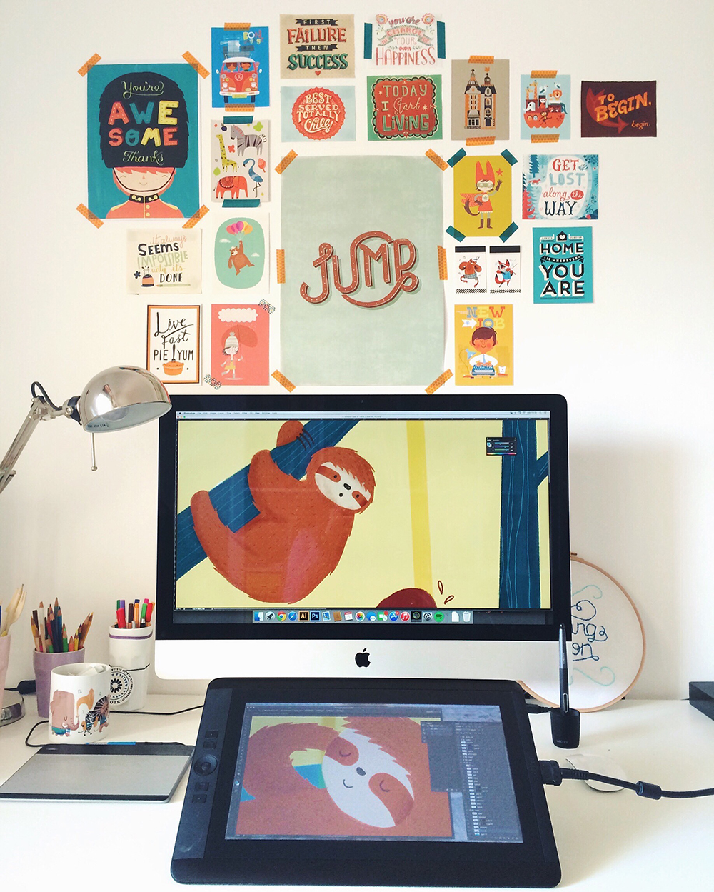
I work from home. All the pre and post production happens in my home office. When I'm actually creating the pieces I'm usually locked in the living room where I have more space and better natural lighting. Also I'm locked trying to keep my dog from coming in and eating my props. It has happened before.
MEDIUM(S) USED?
Photography
PREFERRED MATERIALS AND WHY? DOES THE MESSAGE DICTATE THE MATERIALS, OR VICE VERSA?
So far I've only used food and the main reason for that is because it's fun.You're not supposed to play with your food but this feels like playing. Also, when you finish it you can eat it,(most of the times at least) so nothing goes to waste. But in the future I'm planning on expanding to other materials.
My goal is always to send messages so most of the times that's where I start: I want to say *this*. What's the best way to say it?
This is how I always approach any project and it's something I brought with me when I started doing this kind of work.

DO YOU USE SPECIAL TOOLS TO BUILD LETTERFORMS? DO THESE VARY AND WHY?
In the beginning I used to create very detailed big sketches before any piece but eventually I simplified. Food doesn't behave the way a pencil or pen would so I often ended up with a very different result. Now as I'm more aware of this I just start with a small sketch in a random piece of paper I find around my desk, nothing fancy. When I know I want some more "structured" letters, I'll probably check my computer font library and get inspired by those.
LIST 3 ADJECTIVES DESCRIBING YOUR WORK.
Funny
Colorful
Delicious
CONCEPT VS. EXECUTION

WHAT CHALLENGES DO YOU COMBAT DURING THE IDEATION/BUILDING PROCESS? HOW DO YOU OVERCOME THESE OBSTACLES?
My challenges often come from my limitations. For example, I don't have a huge space to work on (my alphabet pieces we're all photographed on top of 24' x 16' wood plates) So that's something I always have in mind when creating. One might think this is a bad thing as it limits my creativity but I think it helps me take a step further and don't settle for the first idea I have.
SOLO VS. SOCIAL? HOW DO YOU OPERATE NOW AND DO YOU PLAN TO CHANGE DIRECTION IN THE FUTURE?
I've worked with a team in other projects and always loved it. My food lettering project started and still is mainly a personal project so I work mainly alone but always ask for help when I want to achieve a specific look and am unable to do it alone. I also asked a friend for advice when I decide to experiment with stop motion as it's something I'm not so comfortable with.
View more of Elsa's work via Instagram.