The Beginnings of Food Typography

French Press, the beginning of a tactile train of design thought.
I've recently reflected over the #foodtypography and #foodtype hashtags I popularized on Instagram, seeing them grow. I get a little warm inside realizing food typography has wafted across the globe, wetting taste buds and turning edible substances into design media. In the spirit of nostalgia, a little over two years to the date of my first post, I've decided to revisit food type's humble beginnings.
Lettering as an experience
As a new freelancer, I had determined to pursue lettering with all my might, but knew my vector forms were, well, flat. I saw the best designers were engaging their audiences across multi-sensory platforms and wondered how to do this myself. I sat down at a coffee shop with a good educator friend and struggled for a jargon-less way to explain this inkling. As I wrapped my hands around my mug, I came up with this analogy:
"Good design is like a cup of coffee. Beyond consuming a beverage, the consumer feels heat from the cup, texture of milk or foam, breathes in the smell- the drink is an experience apart from necessity."
My friend, being literal, suggested I make artwork out of coffee. This was, in fact, a great idea.

Respective work by Lauren Hom and Kyle Read.
Food type had been used sparingly as one-offs in the past, all of which utilized the materials incidentally without applying a typographer's touch. The novelty of food as lettering trumped the presentation and legibility of the forms. I chose to apply my background in illustration, sculpting, and painting to create letterforms with dimension, play of light and edges, and happenstance flourishes with personality. After an extensive internet search for this concept, I found nothing in existence bearing resemblance to my vision. This was quite the surprise, my opportunity to contribute something new, for which I excitedly began creating and buying URLs.
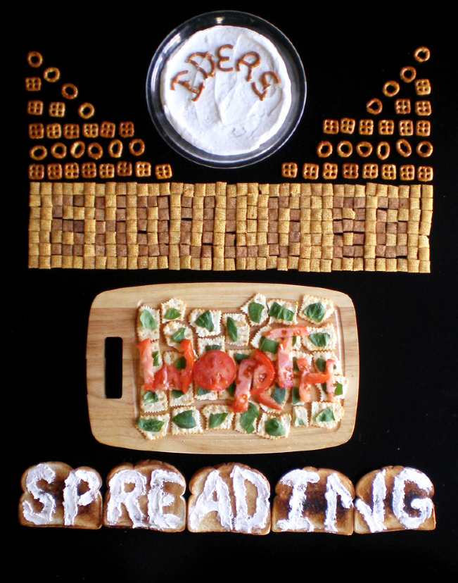
Food Lettering NOT Food Type
Not being a total novice to the lettering game, I thought long and hard about what to call myself. I had made five images before realizing there wasn't a consistent name for this style of work and was struggling to tag my pieces. Allan Peters and I and labored over a my title in Target's Food for Thought video but couldn't find the right fit. Food letterer sounded awful, typographer was by definition incorrect, and stylist sold my talents short.
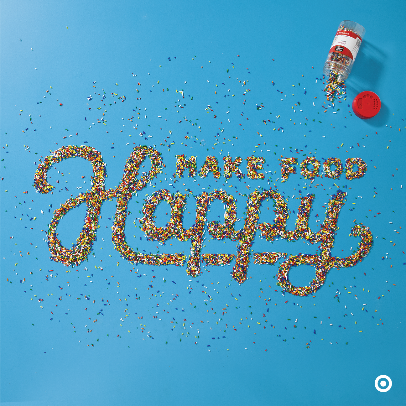
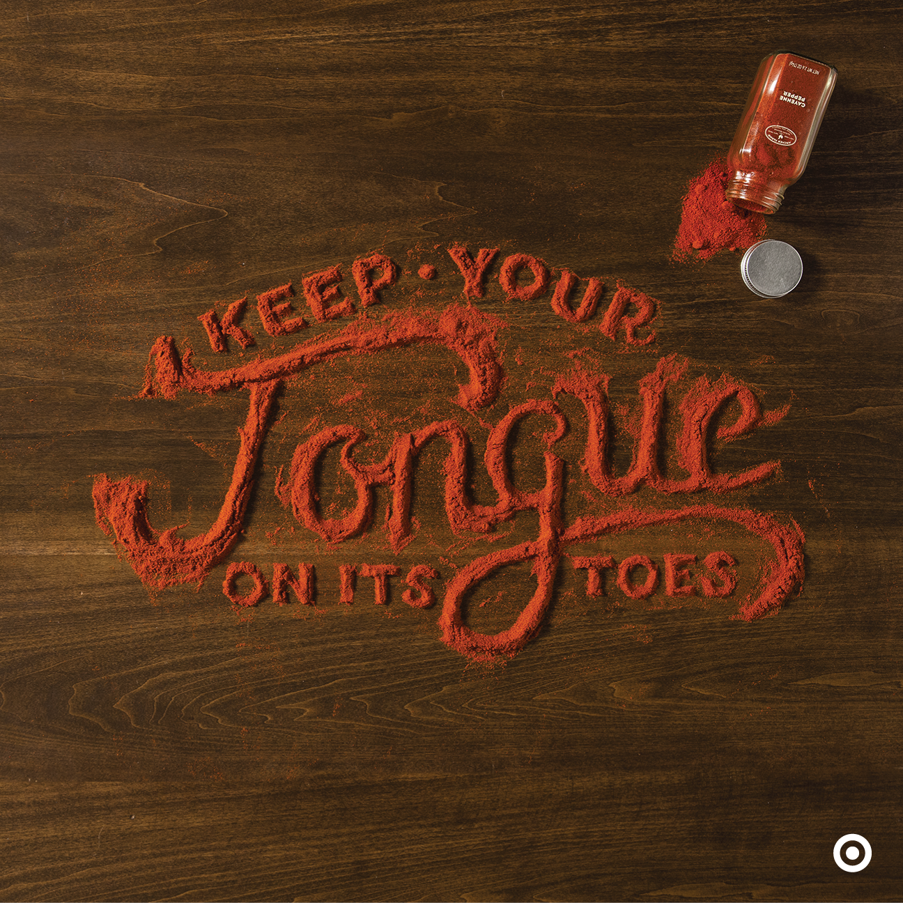
Work from my first commercial campaign for Target.
In the end Food Typographer won out for two reasons: 1) At the time I realized the common person would better understand typography over lettering and 2) typography could be tagged as the full word or its abbreviated form, type. This misnomer is now laughable but has assured widespread acceptance and twice the social reach of the proper term.
Despite the coining this term, I have no plans to create typefaces, as I find they have obvious setbacks. Photographic typefaces would be heavily limited in their size capabilities and could only function as header text, losing the object's legibility at smaller sizes. Larger sizes for billboards would require higher ppi resolutions and excessive post production to fit seamlessly on different backgrounds. Rarely do I use typefaces or fonts to influence my work, instead relying on the materials to dictate the best course. I've chosen a symbiotic relationship with my materials, suggesting rather than forcing their direction. Lettering allows for incidental flourishes and ligatures associated with calligraphy, the true nature of my work.
Form to Table
I'd like to pretend I began with a clever notion of using food for existential purposes, but in reality I was broke and unable to afford supplies. Initially I bought ingredients with the hope of scraping them back into the container to consume later, literally eating my words. After creating several pieces, I realized my work was evoking memories for my viewers, times spent around the dinner table, in the garden, their hands working on a favorite meal or cherished project. Eating is communal and inherently universal in experience, and the work flourished online, touching photographers, illustrators, mom bloggers, and businessmen.

My storytelling has always been subtle; harnessing the message of food and directness of lettering gave viewers different levels of experience: scanning, chewing, and consumption. A viewer could scan and read the word or phrase instantly because the letterforms were properly constructed, chew on the relationship between the word and the chosen substance, or consume the clever and subtle relationships between the copy, food, and propping like a layered onion. Exploring these relationships made for a new and different expression, one many could sink their teeth into excitedly.
Carving a Niche, Spreading the Love
I began developing a style to explain my process and showcase the final images, all of which had practical applications. Top down shots became my delivery method of choice, but I relished the opportunity to show low side angles to prove my work was done in analog. Because I often had bowls of ingredients or handfuls of the materials nearby, I started placing these items into frame to tell the story of my workspace. In many of the final images or videos, my hands appear in the shot to give scale to the workspace. These techniques became popular ways to document and embellish this style of work, but the concepts were rooted in practicality.
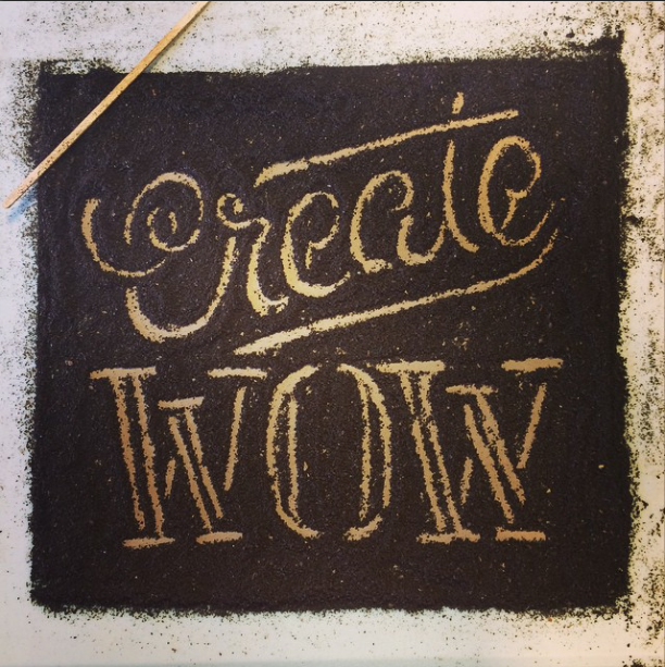
With confidence in my expertise of various materials, I've begun giving workshops to help others expand their own conceptual processes. I'm less interested in teaching students to reproduce my work and more concerned with providing outlets to explore new ideas across mediums. Together we tackle the difficult task of letting go of control, leveraging our strengths to hone our weaknesses, and accepting limitations. My students attempt their own idea or a provided phrase and set to work with their hands for approximately an hour; once their idea is fleshed out to 80% completion, I offer some criticism and allow them to tweak their images for a final shot. Because my work is most often used in social media, we upload the finished projects to Instagram, united under a hashtag for viewers to appreciate. My Orlando workshop at Real Thread utilized #createWOW; for Creative South in Columbus, Georgia, we opted for #CS15wordplay. My next workshop takes place in Cleveland's Weapons of Mass Creation, exact timing to follow. I'd love to word play with you!

Photo by Alicja Colon.
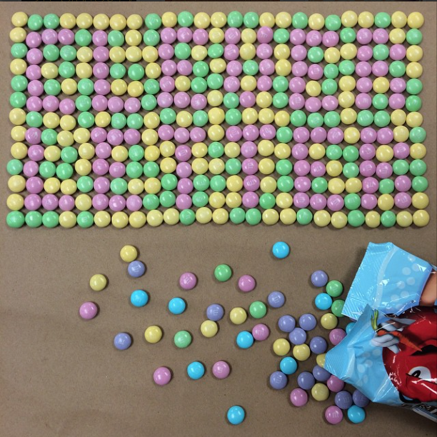
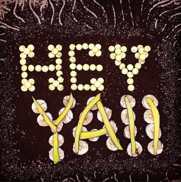
Respective workshop examples by Clark Orr, Cingol20, and James Michael.
This project has been on the design community radar for some time, but only recently have I begun seeing legitimate offshoots with their own audience and message. I was approached by and wholeheartedly approve Enon Avital's, Hebrew Type, a great example combining the beauty of Hebrew characters and Jewish tradition. I am honored by the gesture and happy to support similar endeavors.
Bending the Rules
While food type and food typography have been great successes, I've only tapped a fraction of my materials. Inedible objects are just as fascinating and posses equal capability to stun and surprise. I've begun a new tag, #dimensionaltype, which is already beginning to pick up steam. My lettering is more than the words they convey; I create thoughtful typographic solutions out of commonplace items. The world speaks to me in beziers and strokes, all of which are waiting to be wrangled.
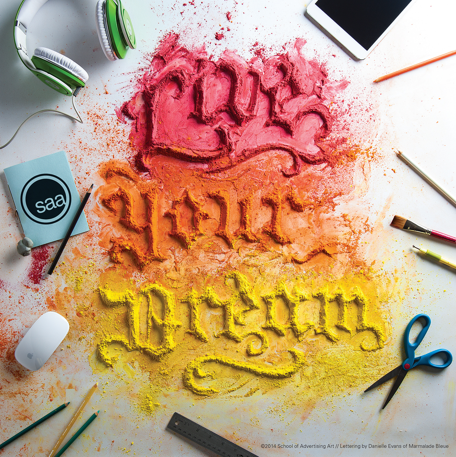
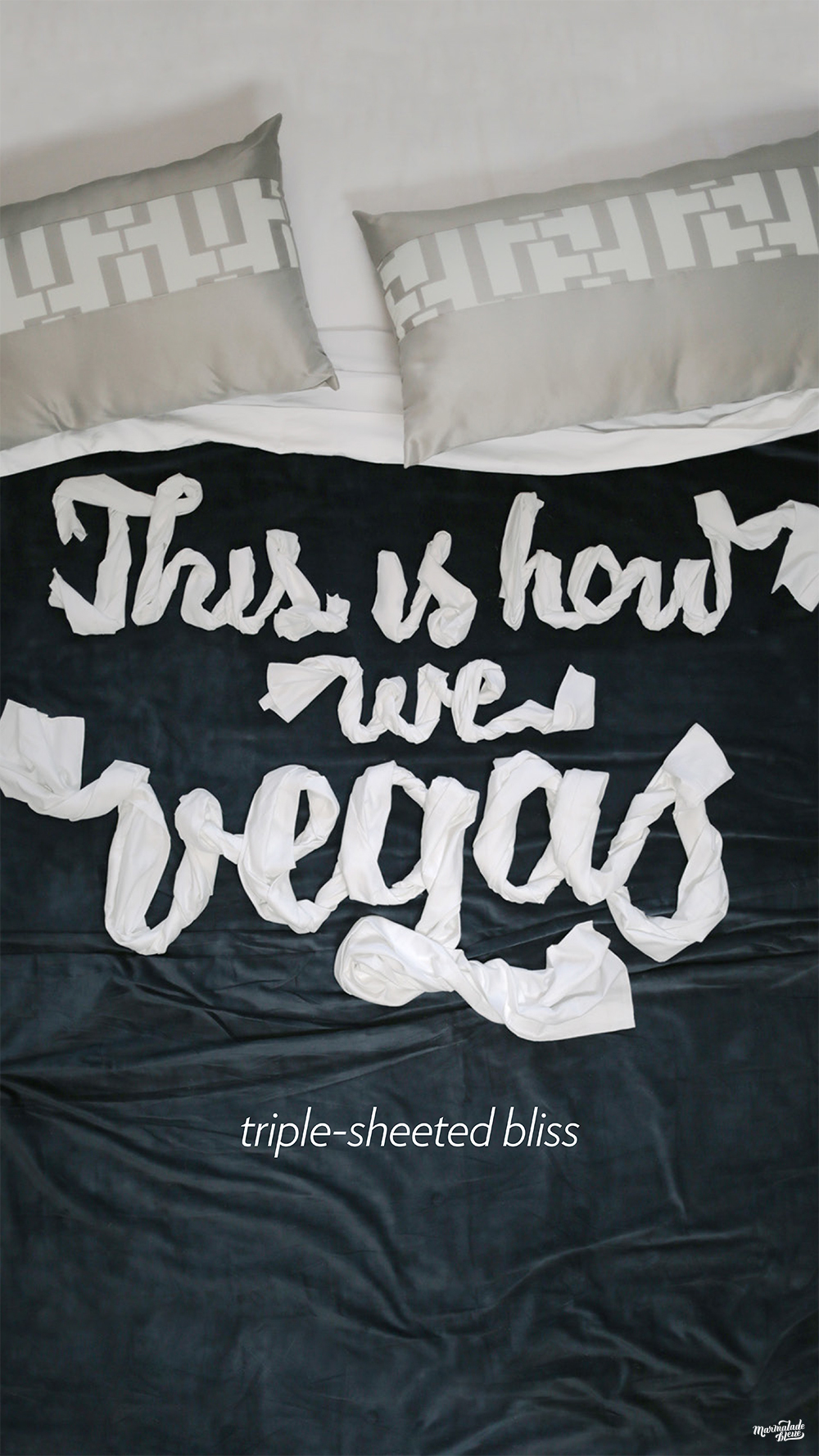
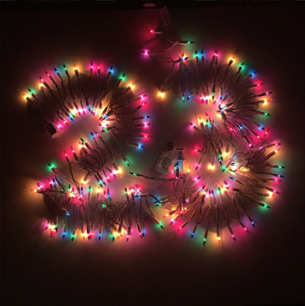
My client projects utilizing paint pigment for SAA and bed sheets for Aria and a personal project for #adventype using Christmas lights.
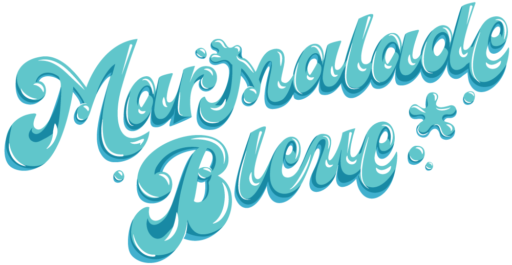
For more insight into my process and work, visit my instagram accounts @marmaladebleue and @foodtypography, my tumblr, or my twitter accounts @marmaladebleue and @foodtypography. A post script of detailed beginnings and additional thoughts can be found in this thorough article by Go Media.